Superstudio 50
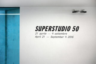
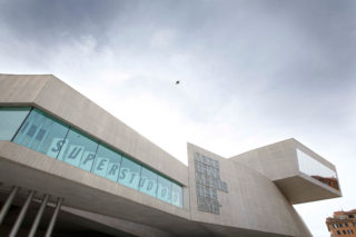
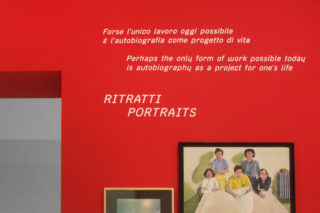
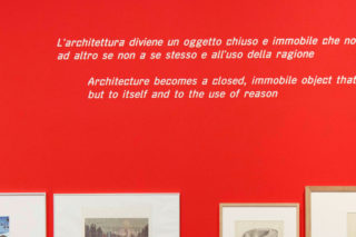
To commemorate Superstudio’s 50th anniversary, MAXXI invited the acclaimed Italian architecture collective to put together an anthological exhibition of their complete works.
Superstudio was founded in Florence in 1966 by Adolfo Natalini and Cristiano Toraldo di Francia, These two original members were later joined by Roberto Magris, Alessandro Magris, Gian Piero Frassinelli and Alessandro Poli. By conceiving of a new anthropological and philosophical vision of architecture — one that is always in close proximity to human life and culture — Superstudio became one of the most influential groups within radical Italian architecture.
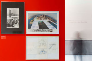
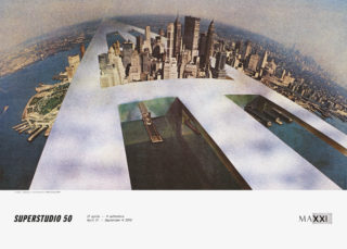
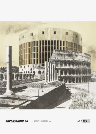
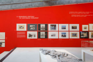
In collaboration with the curator Gabriele Mastrigli, Superstudio members Adolfo Natalini, Cristiano Toraldo di Francia and Gian Piero Frassinelli gathered together over 200 objects, graphic works, photographs and installations created by the collective over the years. These included such seminal works as The Continuous Monument series (1969), Architectural Histograms (1969–70), The Twelve Ideal Cities (1971), the five films of The Fundamental Acts (Life, Educations, Ceremony, Love, Death, 1972–73), tracing the full arc of the group’s career up until its disbandment in the early Eighties.
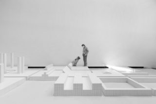
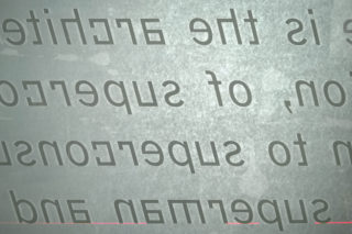
Superstudio’s most iconic works are imposing and unassailable: boundless reflective surfaces that spread out horizontally across the landscape. These are ambitious architectural projects that sweep away all that comes before them. Such ideas are not easily communicated by traditional drafting techniques. Instead the group developed its own methods of visually representing these radical proposals, and consequently graphic design became integral to all of Superstudio’s projects.
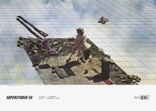
When developing a visual identity for the exhibition, recognition of the group’s formidable abilities as graphic designers in their own right forced us to engage in some critical self-reflection. The most likely outcome of any proposal that seeks to compete with — or, worse still, manneristically repeat — Superstudio’s graphic design works is failure. Our solution was to follow Superstudio’s lead conceptually, rather than formally. In Superstudio’s hands, architecture becomes landscape; we sought instead to transform typography into architecture. Or, better still, superarchitecture.
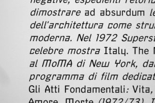
In practice, we created a typeface ad hoc for the exhibition, designing some letters with a particularly strong form in order to recall the powerful and expansive architectural statements for which Superstudio is known. We opted for a condensed font, and focused particular attention on the shape and kerning of the letters. The effect being, in the words of Eric Gill, that “there is not much by which to recognise which is which, and from a distance the two are indistinguishable.” In this way we were able to create a continuum between the letters, echoing the group’s Continuous Monument. Finally, as perspective is central to much of Superstudio’s output, we chose to work in italic in order to further consolidate the rapport between the typography and the works on show.
