Rethinking the City
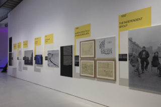
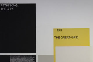
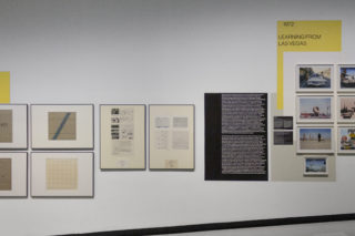
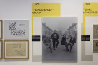
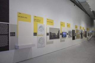
Rethinking the City is a 60 meters long timeline. It is part of the exhibition The Street. Where the World is made, curated by Hou Hanru and hosted at the MAXXI museum, Rome; It gathers more than 140 artists and over 200 works. The exhibition is divided into thematic sections: Mapping, Interventions, Street Politics, Everyday life, Good design, Community, Open institutions. The aim of the exhibition is to bring back to the visitors a “scenario for understanding the new functions and identity of the modern-day street”. Quoting the title, the street is the place where the world is made, a laboratory for artists, architects, performers, musicians. Works of art, architectural projects, photographs, performances, site-specific interventions are mixed together to create, without interruption, a complex, fully immersive and sometime confusing (as the street is) environment inside the space of the museum.
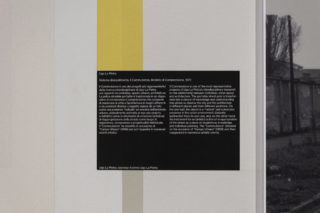
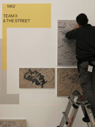
Rethinking the City‘s wall on architecture, curated by Pippo Ciorra and the curatorial team, is part of the section Mapping; it includes in chronological order the projects of Archigram, Archizoom Associati, Atelier Bow Wow, John Randel, Jr., Ludwig Karl Hilberseimer, Le Corbusier, Farzin Lotfi-Jam & Mark Wasiuta, Ludovico Quaroni, Mario Ridolfi, Alice and Peter Smithson, Georges Candilis, Alexis Josic, Shadrach Woods, Superstudio, Ugo La Pietra, Robert Venturi, Denise Scott Brown, Steven Izenour, SITE (James Wines), Vito Acconci (Acconci Studio), Steven Holl, Mirko Zardini.
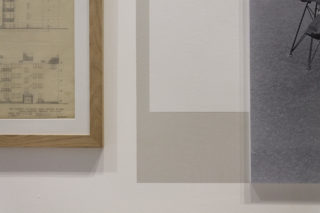
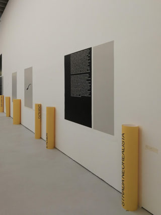
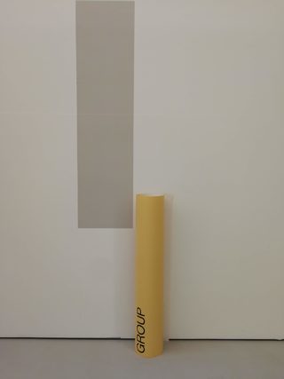
To design the graphic layout and identity of the timeline we decided to use one of the language of the street: stratification. At the beginning we thought to a very rich and multi-layered project, because we wanted to bring back the chaotic and osmotic character of the urban space. The original layout was made by materials get on loan from the imaginary of the street, paper posters, planar OSB wood panels, big vinyls. Unfortunately, the client was a little bit afraid of it, especially about the impact of the artworks in proximity to the graphics so that we had to reduce the complexity of the project.
The final result is a too clean for us, and a bit static, but it’s OK.
