Paolo Pellegrin. Un’antologia — Poster
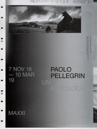
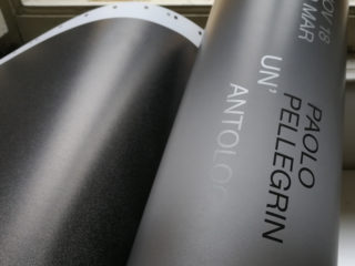
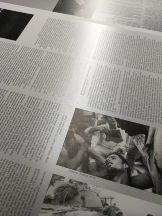
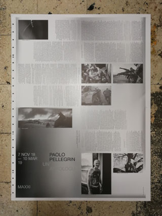
The photographs by Paolo Pellegrin suggest us a strong dichotomy between a fragile and dramatic space and some special moment of light that are a sort of soul of the visual intensity of his images.This ambivalence is, for us, also the link between the ethic of the reportage and the aesthetic sensitivity that we decided to translate in the use of the black and white for the entire graphic design. White has no color but the maximum of brightness. Black is the opposite of white. Silver is black and white beyond the gray scale, it is made of metal particles that produce reflections when struck by light. Beyond black and white, however, there is a slight shift, the silver, the metamorphosis from documentary image to thought, therefore a poetic act of which we wanted to make evident through the use of silver in the exhibition and in printed materials.
Related project: Paolo Pellegrin. Un’antologia
