Open House Roma 2019 — Utilitas
23
19
With its three millennia of history, Rome is certainly one of the first metropolis of humanity. Metropolis are a kind of mothers cities and part of their identity is based on the project of boxes for sociality, movement, relationship: that is what we call architecture. This is why the ancient romans — urban planners and conquerors, with a strong cultural identity — chose utilitas as one of the weapons for their conquests and the expansion of the Empire.
In his text De Architectura Vitruvius tells us about utilitas. Together with the solidity (firmitas) and the beauty (venustas), utility was one of the three requisites that architecture had to possess. The architecture was in fact considered by the Romans as the principal of the arts precisely because of its usefulness.
De Architectura was written in Latin around 15 BC, yet the his interest was renewed many years later in the Renaissance (in 1450 Johannes Gutenberg — by printing the 42-line Bible — will kick off to an epochal revolution) with the numerous publications and attempts to reconstruct the original work of Vitruvius.
Working on this project, what it seemed clear to us was that the word utilitas is not only one of the qualities that a single architectural project can and should have — especially for Romans, but not only — but it is also related to certain historical periods in which architecture has utilitas corresponded with a strong cultural progress and a lively intellectual spirit.
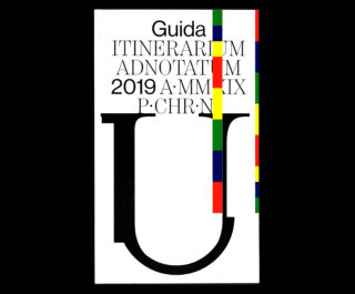
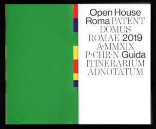
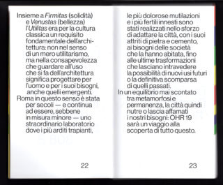
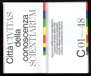
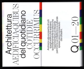
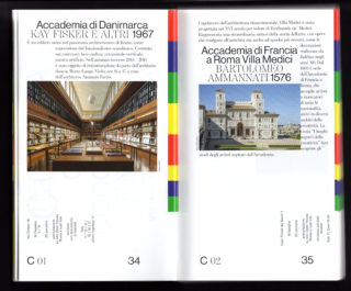
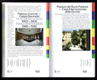
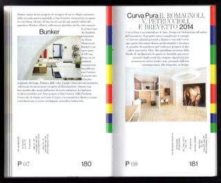
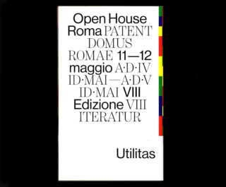
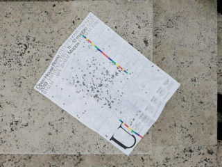
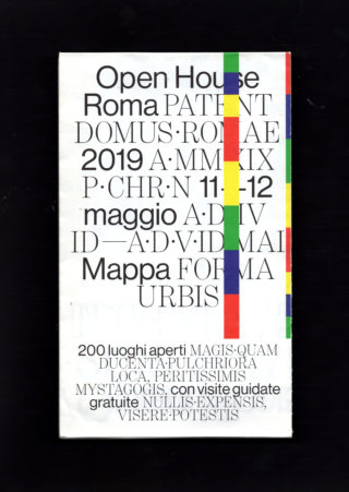
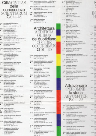
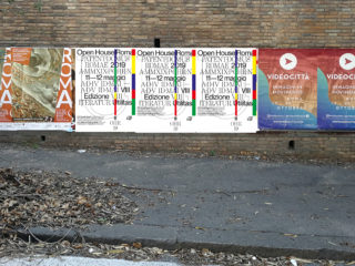
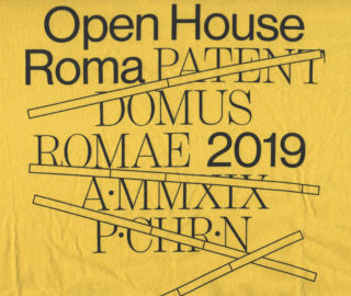
For the graphic design of Open House Roma 2019 we decided to narrate a sort of “set of qualities” through which the metropolitan and contemporary city of Rome formed and placed its cultural resistance. Not a mere reference to antiquity, therefore, reduced to a souvenir, a relic, but a link to the characteristics of transformation and renewal of the city itself.
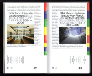
If a sort of revitalization of the past is the key that some contemporary architects seek in their projects through late modernism (cfr. The new museum complex for the Ara Pacis designed by Richard Meier & Partners Architects), in an opposite but yet complementary way we therefore imagined a sort of Vitruvian grafting exercise in the contemporary panorama.
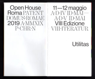
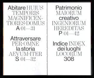
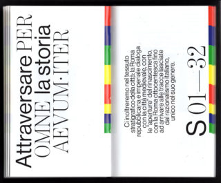
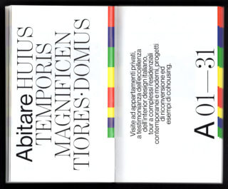
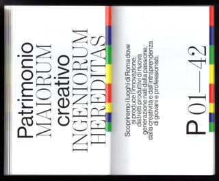
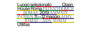
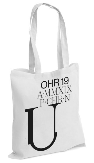
Through the use of the Latin in parallel with the Italian one, we wanted to bring out one of the greatest legacies by ancient Rome. We wanted to demonstrate that Latin, which is considered a “dead language”, is instead more than alive because it is the root of many of our daily words and is not just gross expedient used in the city of Rome to attract tourists.
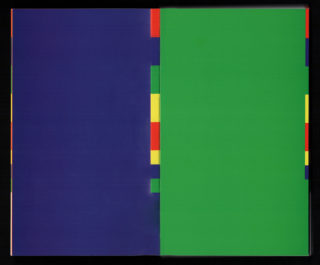
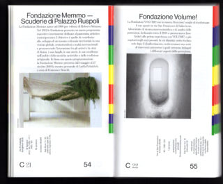
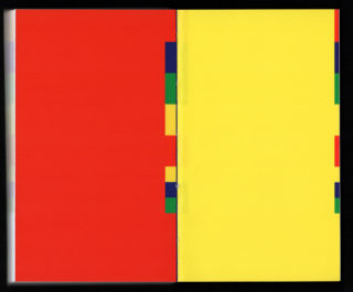
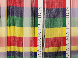
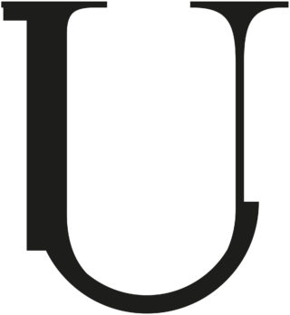
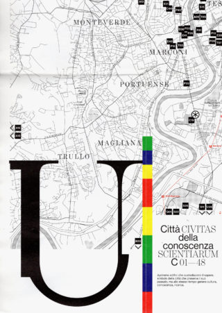
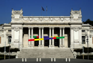
The letter “U” symbolizes the mixture of the two typographic elements as well as the important denunciation about what happened with the Palazzo dei Diamanti competition in Ferrara — https://www.artribune.com/progettazione/architettura/2019/02/labics-palazzo-dei-diamanti-ferrara/ . In opposition, the colored sticks are the most cheerful, lively and dynamic element of the city; they are “mikados” that, during the weekend of Open House Roma 2019, will moves arbitrarily arranging in different compositions, suggesting the social function of architecture — as theorized by Herman Hertzberger — its ability to generate stimulating contents, an active participation of the citizen and the free expression of the language of the community (Herman Hertzberger — https://www.domusweb.it/it/architettura/2012/09/21/la-scuola-come-metafora-del-mondo.html).
1
/ 36