Open House Roma 17
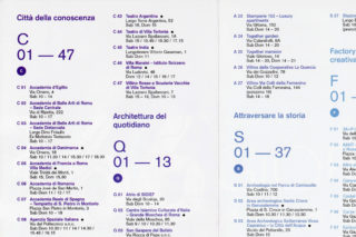
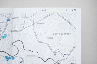
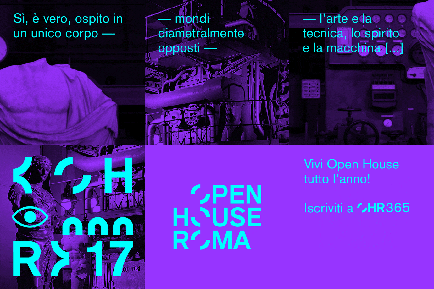
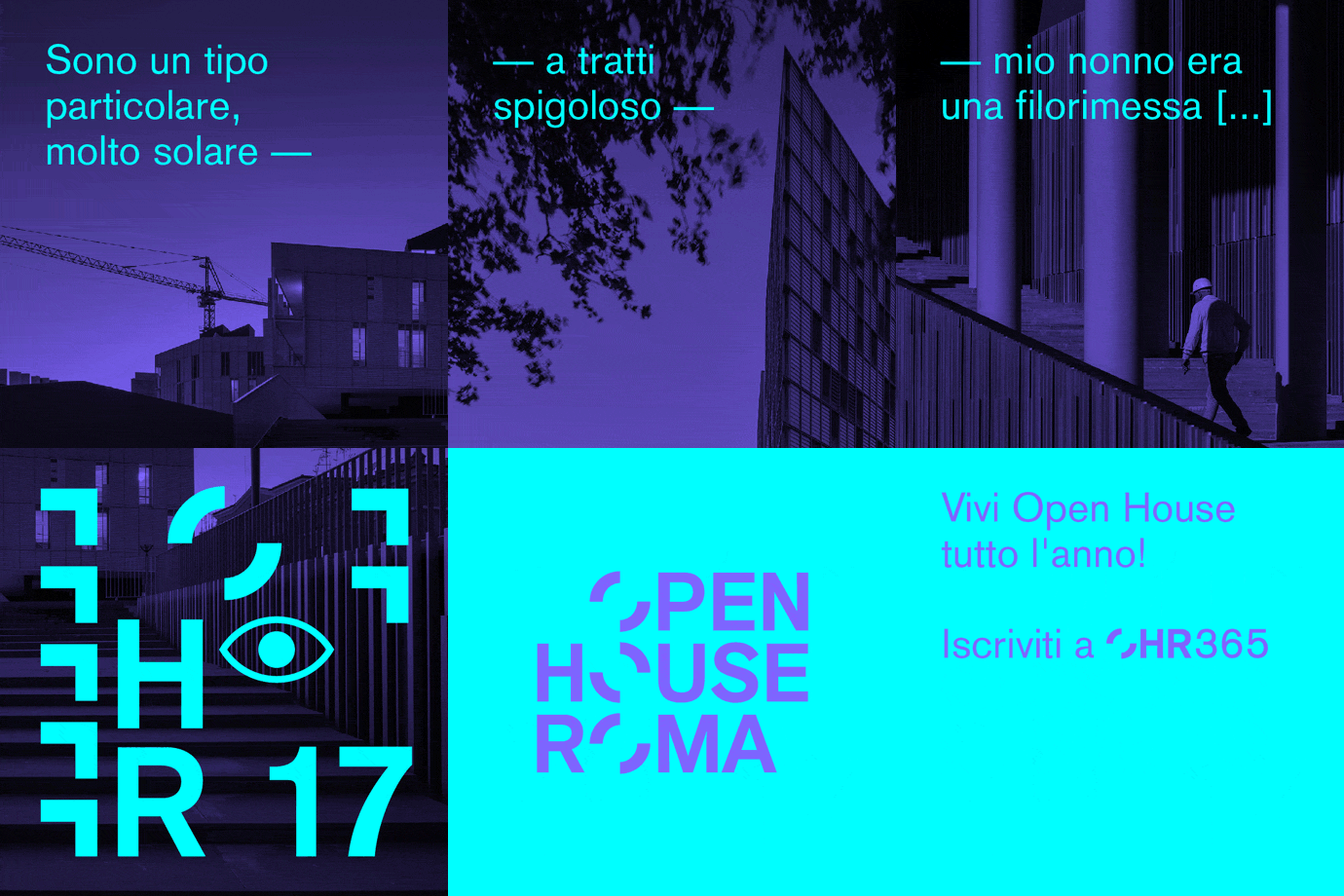
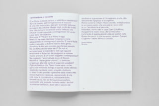
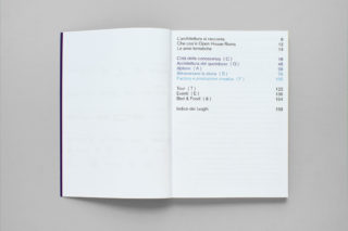
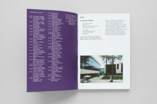
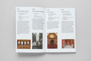
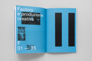
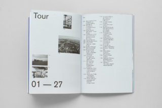
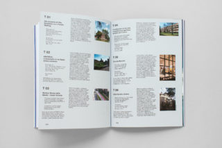
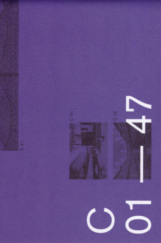
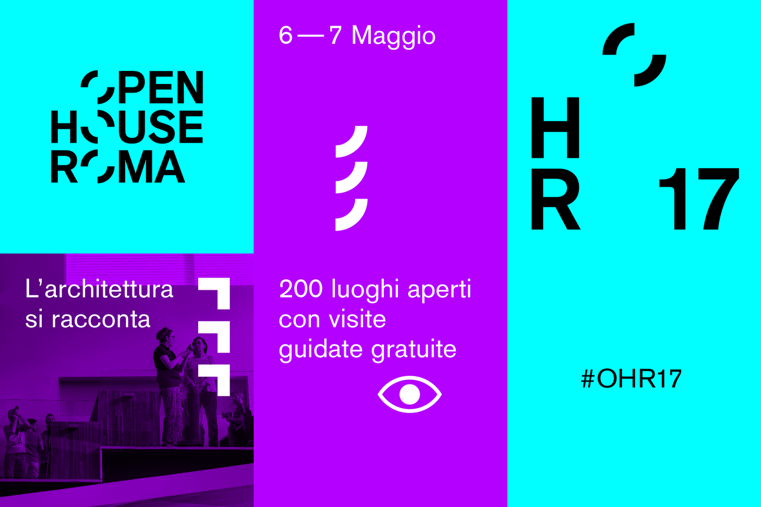
For the 2017 edition, Open City Roma invited us to design the graphic identity of Open House Roma: an annual event that gives free public access to hundreds of the city’s buildings. Above all, these tend to be modern and contemporary structures, however a number of historical sites are also included.
The subtitle of the 17th edition was “L’architettura si racconta. Duecento luoghi aperti con visite guidate gratuite” (Architecture Speaks. Two hundred spaces open to the public with free guided-tours). The intention of this sentence — and indeed the purpose of the cultural event more generally — prompted us to reflect upon the relation between a city’s architecture and its inhabitants. It is an often-heard complaint that contemporary architecture is too removed from the lives of ordinary people. Nowhere is this lament more common than in Rome: a city with a seemingly insatiable yearning for its past glories. Meanhile Rome’s historical achievements weigh heavily upon the present, and the city struggles to comprehend the value and beauty of the contemporary.
As graphic designers working in the field of architecture, our work generally addresses a niche audience of professionals. To communicate with these industry-insiders, we employ a very specific visual lexicon. Yet we rarely call into question this highly specialized architectural language. However, in this particular case, the purpose of the event was very different: our aim was to bridge the gap between the city and its inhabitants, helping to bring the architecture in their environment closer to hand, and making it easier to understand. Here it is architecture itself that says “the city is yours, let me tell you the story of this building”.
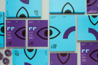
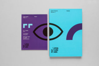
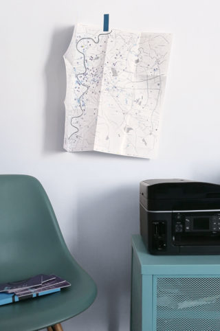
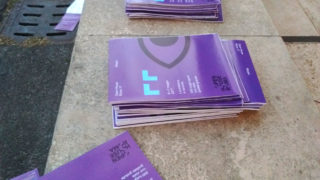
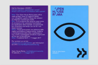
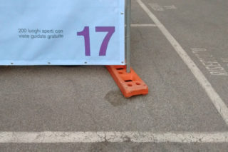
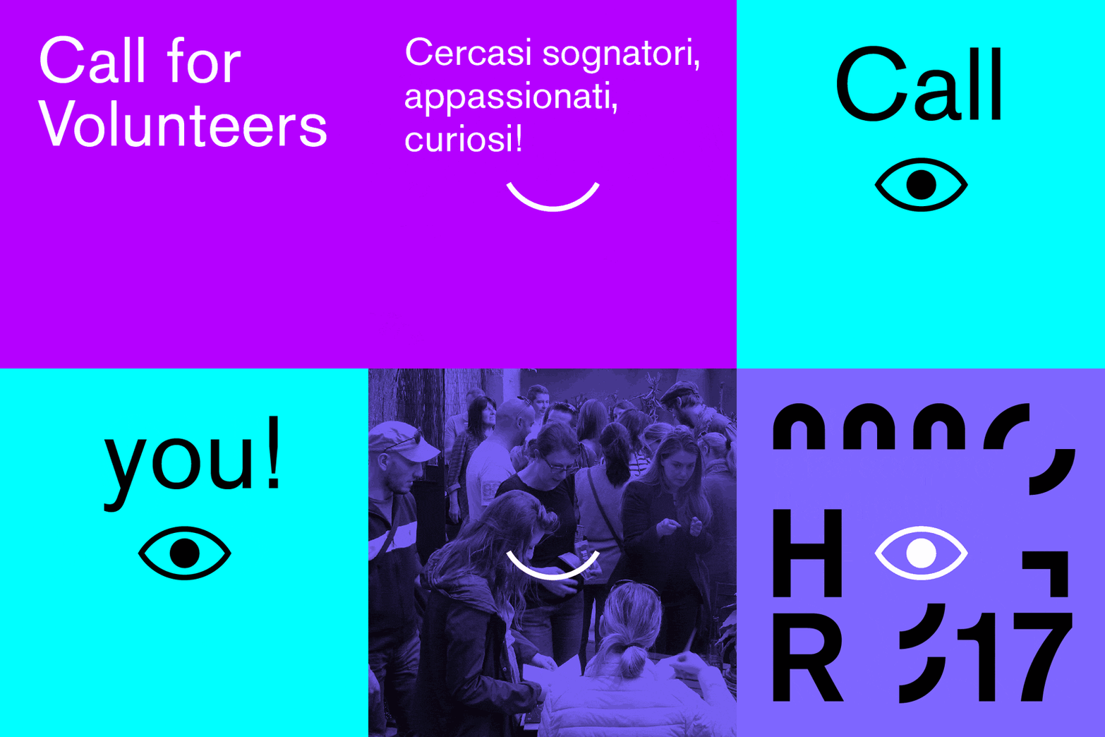
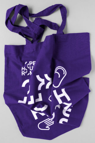
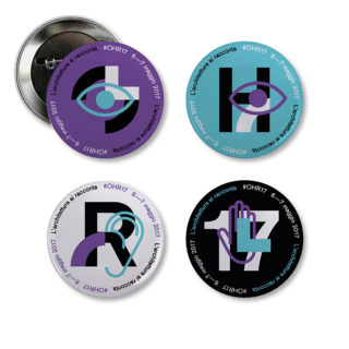
Conscious that we were designing for a cultural event — and thus would not only need to produce a guide and map, but also advertising and promotional materials such as posters, pins, and social-media banners — we set out to develop a visual language that could be employed in many different ways. With the relationship between people and architecture kept fully in mind, we opted for a form of graphic design that would speak with a friendly tone of voice.
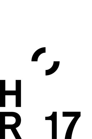
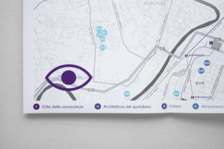
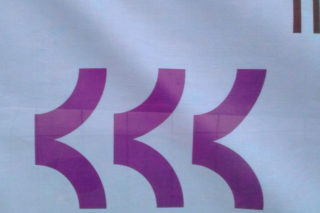
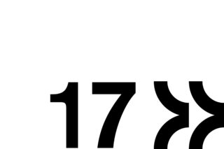
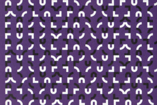
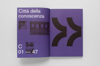
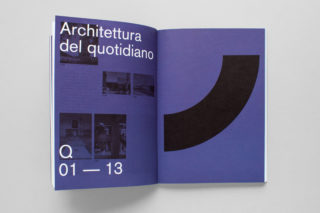
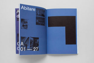
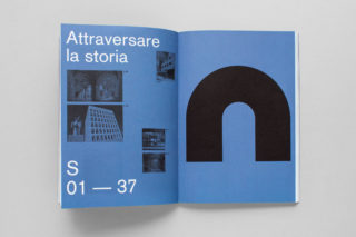
We wanted to represent the idea of a “lived” architecture; made with, and lived by, the people. The logo for the previous edition of the event featured a letter “O” that symbolized the banks of the river Tiber. From this we obtained some graphic shapes and used them as the basis for the part of the visual identity relating to buildings and sites. In practice, we designed simple symbols that we could then combine in a variety of ways in order to create aqueducts, amphitheaters, streets etc. — icons relating to the city of Rome.
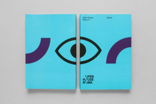
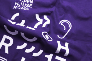
Following this, we added the people that would view, listen to, and touch the city: a big eye, hands, noses, ears… These graphic signs referred to the notion of the “human”. By employing a different combination of these symbols every time, we were able to design each new layout in an entirely different way without losing stylistic coherence.
