Corpo Movimento Struttura
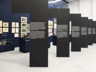
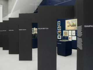
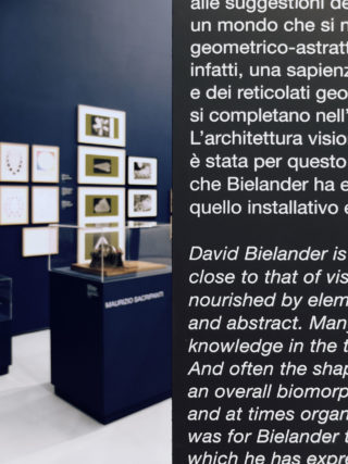
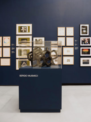
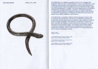
The exhibition Corpo Movimento Struttura. Contemporary jewellery and his construction, hosted at Centro Archivi MAXXI Architettura in November 2017 and curated by Domitilla Dardi, shows the jewels, or even better the artpieces, of international designers like Giampaolo Babetto, David Bielander, Helen Britton, Monica Cecchi, Peter Chang and Philip Sajet.
The exhibition investigates about the role of contemporary jewellery and about factors that it has in common with architecture. The contemporary jewel is an object open to multiple readings, the first traditionally being aesthetic. Alongside this plane exists structural research, in which what counts is the complexity of the structure of the jewellery and therefore the idea and the form.
“Jewels inhabit our body, living its irregular surface and its constant movement. They do so thanks to their structure, exactly as architecture does, animated as it is by the dynamism of the people who use it. Jewellery and architecture are here considered as two interlocutors in a dialogue that focuses on the body in motion and on structure.”
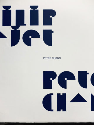
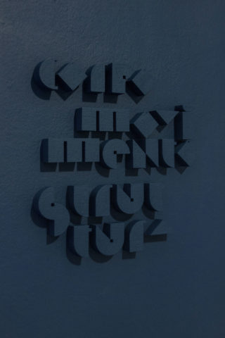
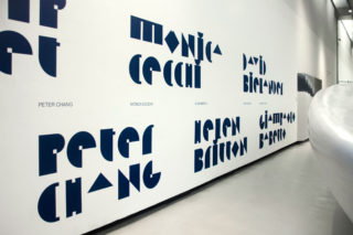
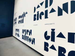
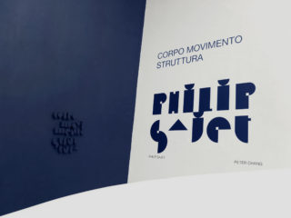
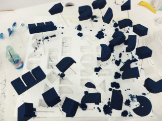
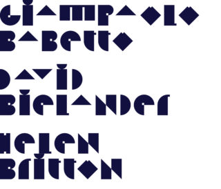
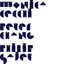
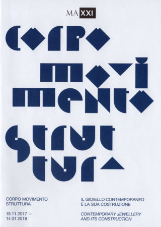
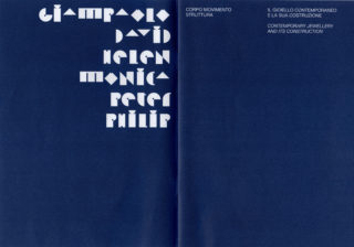
For the identity of this exhibition, we decided to design a custom typeface. The typeface should have represented the relationships between the architecture and people, but also jewellery and body. A sort of variation/inversion of scale, this was the main concept on which we have based the whole design of the typeface. Every letter was conceived to recall the two scales of drawing: scale 1:1, for the jewellery, and scale 1:100, for the architecture. Philip Sajet called this typeface “Splendido” [gorgeous], obviously he was joking, but we appreciated that name.
